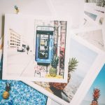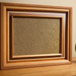
Styling a gallery wall is less about filling space and more about telling a story that evolves with you. I always start by laying out every piece on the floor, playing with scale, color, and texture until the arrangement feels alive rather than static. Mixing framed oil paintings with vintage mirrors or three-dimensional objects creates a rhythm that draws the eye across the room. Don’t be afraid to pair a bold, abstract canvas with a delicate botanical print; the contrast is where the magic happens. Trust your instinct over perfect symmetry, because a intentionally eclectic wall feels like a curated collection rather than a decorator’s afterthought. Aim for a cohesive color palette to tie disparate pieces together, but let the individual items breathe and shine on their own terms.
Selecting the right frames for mixed media cohesion
Uniformity in frame construction is the single most effective tool for taming a chaotic mix of media, from delicate watercolors to heavy ceramic tiles, gallery wall styling ideas. If you are combining thin paper prints with thick sculptural pieces, a standard 1-inch black wood frame provides a consistent visual boundary that ties disparate elements together without fighting the art. The key is matching the mat board color and texture across every piece, which creates a rhythmic pattern that guides the eye smoothly across the wall. This approach works especially well in rooms with bold architectural features, where a neutral frame prevents the artwork from competing with the surrounding design elements.
Varying frame widths can add depth and interest if you establish a clear rule before hanging anything on the wall. For instance, using a thicker, chunky frame for larger statement pieces and a slimmer profile for smaller drawings creates a hierarchy that feels intentional rather than random. The material finish should also align with the room’s existing metal accents; mixing matte black iron with brushed gold brass usually looks cluttered unless balanced by substantial negative space. I recommend limiting your palette to two or three frame colors maximum to maintain visual flow and prevent the arrangement from looking like a haphazard collection of unrelated items.
Consider the weight distribution carefully when selecting heavier frames for large canvases or glass-protected mixed media collages. Lighter aluminum or thin wood profiles might flex or sag over time if they are not properly anchored into wall studs, which can throw off the entire gallery alignment. Use a level and a measuring tape to mark precise hanging points, ensuring that each frame sits at the exact same height from the floor for a polished finish. This attention to structural detail ensures that the visual cohesion you achieve with your color choices remains intact for years to come without constant readjustment.
Mapping layout options before committing to nails
Before you start hammering a single nail, sketching the entire configuration on paper or digitally can save hours of frustration. I recommend using painter’s tape to outline each frame’s footprint directly on the wall, allowing you to experiment with height and spacing without leaving permanent marks. Consider the visual weight of each piece; a heavy, ornate oil painting demands more breathing room than a slimline print, so group heavier items toward the center or bottom to maintain balance. For a cohesive look across mixed media, I often suggest establishing a consistent gap, typically two to three inches, between frames, which creates a rhythm that guides the eye smoothly across the composition. If you are working with an irregular wall shape, mapping out a loose grid can help anchor the arrangement, but leave some intentional negative space to prevent the display from feeling cramped or overwhelming.
Another critical step is evaluating the sightline from the primary viewing distance, usually seated on a sofa or standing at the room’s entrance. I find it helpful to step back and view the proposed layout from multiple angles to ensure the top edges of the frames align with a consistent imaginary line, typically positioned at eye level, roughly 57 to 60 inches from the floor. This subtle alignment creates a professional polish that ties disparate art forms together, whether you are blending vintage photographs with contemporary abstracts. Don’t shy away from overlapping frames slightly or stacking a smaller piece beneath a larger one; these deliberate overlaps add depth and prevent the arrangement from feeling too rigid or formulaic. Taking the time to visualize these interactions beforehand ensures that when you finally drive in the nails, the result feels intentional and effortlessly curated.
Choosing artwork sizes and proportions for wall balance
The first rule when arranging a gallery wall is to treat the entire composition as one single piece of art rather than a collection of separate frames. Interior designers typically recommend that the total width of the grouping should be roughly two-thirds to three-quarters the width of the furniture piece it sits above, such as a sofa or console table, to create a sense of grounded proportion. For a standard eight-foot ceiling, the center of the arrangement should hang between 57 and 60 inches from the floor, which places the focal point at eye level for the average adult and ensures that smaller pieces don’t get lost against a tall wall space. Mixing scales is where the real personality emerges; pairing a large statement piece, perhaps a 24-by-36-inch canvas, with a cluster of three smaller square frames creates visual rhythm and prevents the eye from wandering aimlessly. Leaving consistent breathing room, typically two to four inches between frames, helps each work breathe while still feeling connected as a cohesive whole.
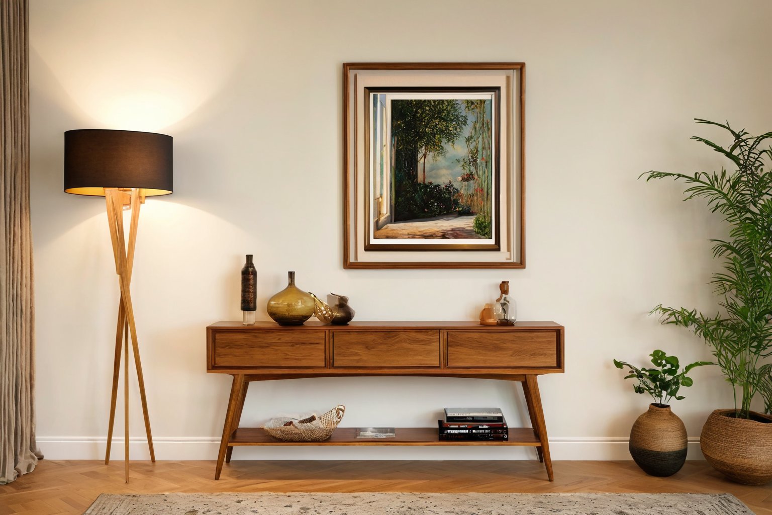
Proportional balance also depends heavily on the shape and orientation of the frames themselves, and breaking the grid can add dynamic interest to an otherwise static wall. Rectangular works oriented horizontally can widen a narrow space, while vertical pieces can draw the eye upward, making a room feel taller, but mixing orientations within the same grouping requires a steady hand and a clear plan. A common trick is to use painter’s tape on the wall to map out the exact dimensions of each frame before committing to nails, allowing you to shift a six-by-eight-inch portrait next to a twelve-by-twelve-inch mirror without leaving unwanted holes. When incorporating three-dimensional objects like plates or sculptural frames, treat them as you would a piece of art of equivalent visual weight, spacing them further apart to avoid a cluttered look. The goal is to achieve a balance where no single element dominates unless intentionally designed to be the anchor, and where the negative space between the works is as thoughtfully considered as the art itself.
Incorporating three-dimensional objects and sculptures
In the realm of gallery wall styling, three-dimensional objects and sculptures serve as the unexpected punctuation marks that transform a flat arrangement into a dynamic visual conversation. A small bronze figurine perched atop a stack of vintage books introduces texture and weight, while a delicate glass vase catches light in ways that flat prints simply cannot. The key is to vary the depth; pairing a shallow relief carving with a rounded ceramic piece creates a rhythm that draws the eye across the composition. When selecting these objects, consider the scale relative to the surrounding frames, a miniature metal insect pinned to the wall can sit comfortably beside a larger framed photograph, provided there is enough breathing room to prevent visual clutter. I often advise clients to treat these pieces as anchors; placing a sturdy wooden mask or a geometric metal sculpture at the center or lower third of the layout grounds the entire arrangement and prevents the eye from skimping across the surface too quickly.
Material contrast is where the true magic happens when integrating sculpture into a mixed-media wall. The interplay between a matte-finished oil painting and a polished stainless steel orb, for instance, creates a tactile dialogue that feels curated rather than coincidental. I recommend choosing objects that echo a color or shape found elsewhere in the display, such as a turquoise-glazed ceramic sphere that picks up the hue of a distant abstract print, but avoid making the match too obvious; subtle echoes are more sophisticated than literal duplicates. Weight also matters, a heavy wrought-iron wall sconce balanced against lighter, airy watercolors suggests a professional eye for balance. Do not be afraid to lean into the quirky; a repurposed vintage tool or a found object from a flea market adds a narrative layer that pure art prints often lack, turning the wall into a story of personal taste and collected moments rather than just a decorative surface.
Finalizing placement and hanging hardware techniques
The moment of hanging arrives after hours of arranging and rearranging on the floor, and the process demands patience and a methodical approach to avoid wall damage. Start by selecting hardware that matches the weight of each piece; lightweight prints can be secured with simple adhesive strips, but heavier canvases and framed works require D-rings and wire or sturdy sawtooth hangers anchored into wall studs using a stud finder. Mark the intended nail positions lightly with a pencil, holding the frame against the wall to verify eye-level alignment, typically 57 to 60 inches from the floor to the center of the artwork, a standard that creates a cohesive visual line across varied sizes. For gallery walls with inconsistent frame depths, consider using French cleats or interlocking systems that distribute weight evenly and allow for micro-adjustments without multiple wall penetrations. Always double-check levelness with a bubble tool before hammering, and remember that a slight tilt can modernize a traditional arrangement, so trust your eye if the overall composition feels balanced despite minor deviations from perfect plumb.
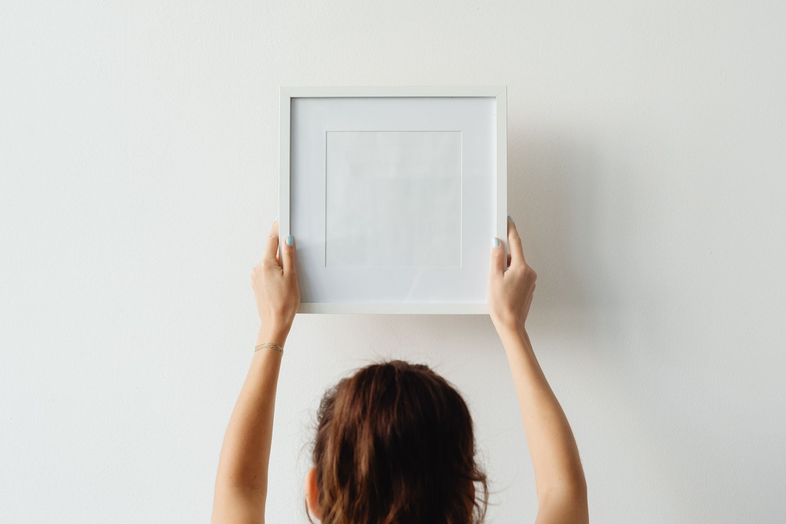
Cable hanging systems offer a flexible alternative for those who anticipate frequent rotations or want a sleek, museum-quality appearance without visible nails across the wall surface. These systems consist of a thin, painted steel cable strung between two ceiling-mounted brackets, allowing frames to slide along the wire and be repositioned with ease, which is ideal for mixed media collections that include three-dimensional objects like small sculptures or textile panels. When planning the layout, account for the drop length, the distance from the cable to the top of the frame, and ensure that the lowest piece clears any furniture or molding below by at least six inches to maintain visual breathing room. Use adjustable hanging hooks that snap onto the cable at precise intervals, and test the tension by gently sliding a piece to the end of the run to confirm it sits flush against the wall without swinging. This method not only simplifies the hanging process but also transforms the gallery wall into a dynamic, changeable installation that can evolve with your evolving taste.
Adding finishing touches and lighting accents
The final stage of a gallery wall often gets overlooked, yet it is what transforms a collection of frames into a cohesive room feature. Positioning picture lights above the arrangement creates a focused pool of illumination that not only highlights textures and brushwork but also prevents the wall from appearing flat during evening hours; a simple swing-arm fixture placed six to eight inches above the top frame directs light downward at a thirty-degree angle, reducing glare on glass while emphasizing the depth of three-dimensional objects. Incorporating a narrow LED strip along the back edge of the molding offers a subtle glow that lifts the entire composition off the wall, making the display feel airy and intentionally designed rather than merely pinned up; warm white LEDs around 2700 Kelvin provide a cozy ambiance that complements wooden frames, while cool white at 4000 Kelvin suits minimalist metal or sleek acrylic. Finally, stepping back to assess the wall’s interaction with surrounding furniture ensures the lighting balance feels intentional, if the room’s primary light source is a dim overhead fixture, adding a floor lamp with an adjustable shade nearby can fill in shadows and make the art feel like an active part of the space’s daily rhythm rather than a static afterthought.
Beyond electrical lighting, the strategic placement of decorative objects can add surprising depth and tie the room’s existing palette together without overwhelming the art itself. A small brass sculpture or a ceramic vase perched on a floating shelf just beyond the outer edge of the frames introduces a tactile element that breaks up the visual monotony of paper and wood, while a strategically placed mirror opposite the arrangement can bounce light around the room and make the gallery feel larger and more open; choosing a mirror with a thin, unobtrusive frame prevents it from competing with the artwork for attention. Additionally, incorporating a few carefully selected plants, such as a trailing pothos or a compact ZZ plant in a matte ceramic pot, brings organic texture and a pop of green that softens the rigid lines of framed media; the live element also helps the display feel less like a curated museum exhibit and more like a living part of the home. These finishing details, though modest in scale, are what ultimately make a gallery wall feel polished, personal, and effortlessly styled.

I have spent years transforming my home into a personal gallery, constantly hunting for unique pieces that bring walls to life. There is nothing quite like the thrill of discovering an emerging artist online and finding the perfect artwork to complement a room. I am passionate about helping others navigate the world of digital art markets to find authentic pieces that truly resonate with their style.