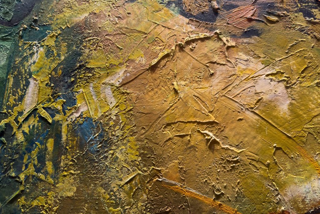
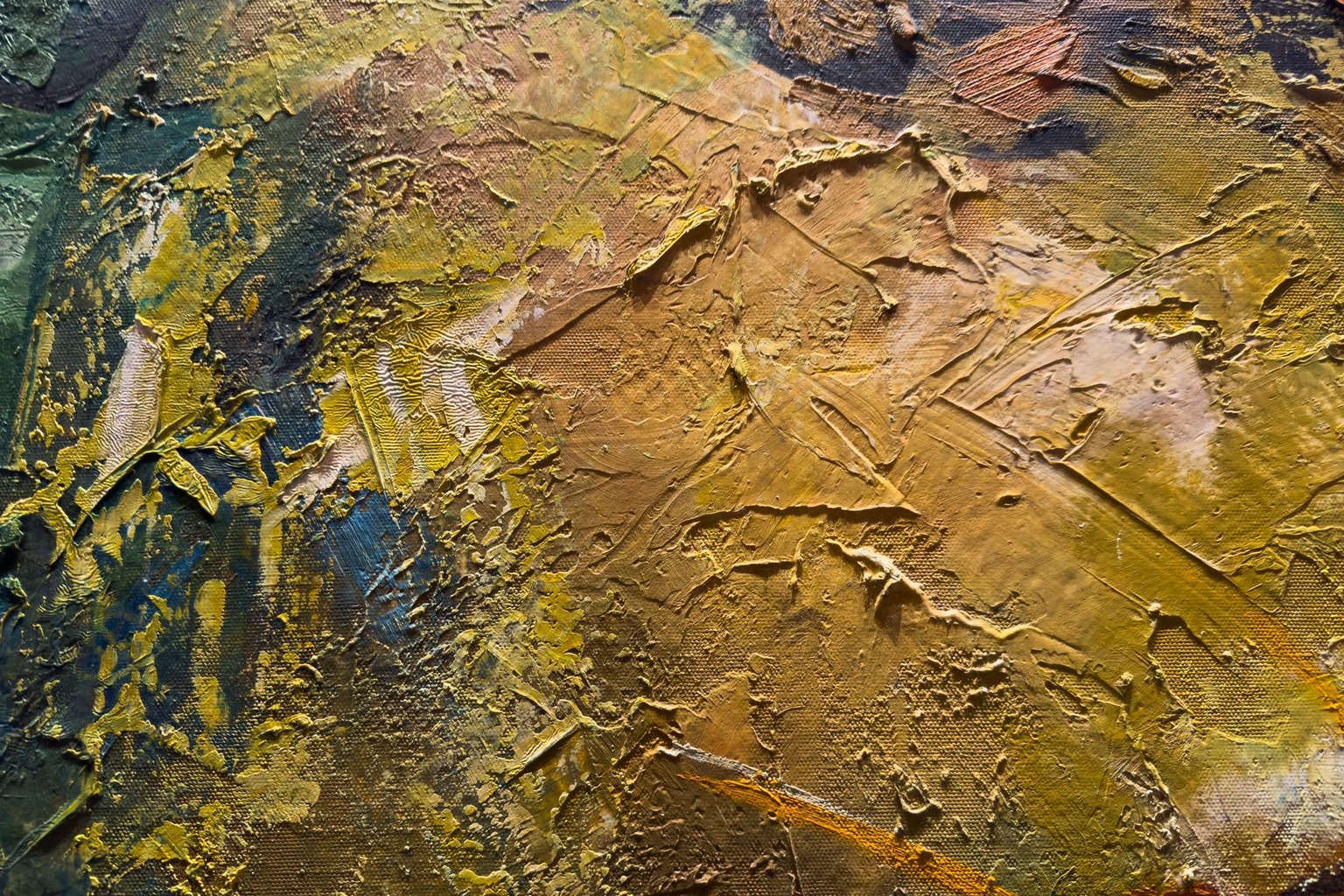
The way color influences perception isn’t just a matter of personal taste, it’s a scientifically validated force that shapes emotional responses, cognitive engagement, and even artistic interpretation. For artists and collectors navigating the online art marketplace, understanding these psychological dynamics isn’t just academic; it’s a practical tool to enhance how viewers connect with a piece. Whether you’re selecting a palette for a new painting, curating an online gallery, or analyzing why certain works resonate more deeply, color psychology reveals the hidden currents that guide emotional and intellectual reactions. The most compelling artworks don’t just capture the eye, they evoke a visceral response, and color is often the silent architect of that experience.
The Biological Foundation of Color Perception
Color perception begins in the retina, where cone cells detect wavelengths of light and transmit signals to the brain’s visual cortex. This process isn’t passive; it’s shaped by evolutionary biology and cultural conditioning. Red, for instance, triggers a primal response because it historically signaled danger (like ripe fruit or blood) or safety (like warmth from fire). Blue, on the other hand, is associated with water and sky, evoking calmness and stability. These associations aren’t arbitrary, they’re hardwired into human cognition. For artists, this means that certain colors carry inherent emotional baggage that can’t be ignored, even if the intention is purely aesthetic. A painting dominated by deep reds might provoke urgency or passion, while a composition centered on cool blues could induce a sense of tranquility or detachment. The key takeaway is that color isn’t neutral; it’s a language of instinct and experience.
Research in neuroscience confirms that color influences brain activity in predictable ways. Studies using functional MRI scans have shown that viewing red hues increases physiological arousal, while blue tones tend to lower heart rate and blood pressure. This isn’t just about individual preference, it’s about how the brain processes stimuli. For online art buyers, this means that the color palette of a digital painting can subtly prime their emotional state before they even engage with the subject matter. A gallery owner displaying abstract works with high-contrast reds might expect a more intense viewer reaction, while a collection of serene landscapes in muted blues could foster a slower, contemplative experience. The biological underpinnings of color perception ensure that these effects are consistent across cultures, though cultural context can refine or amplify them.
How Cultural Context Shapes Color Meanings
While some color associations are universal, others are deeply embedded in cultural narratives, which can drastically alter their perceived impact. In Western art history, white has long symbolized purity and divinity, as seen in religious paintings like Caravaggio’s The Calling of Saint Matthew. However, in many East Asian cultures, white is associated with mourning and funerals, carrying a starkly different emotional weight. For an artist selling work internationally, this nuance is critical, what might feel sacred in one context could feel jarring or inappropriate in another. The same applies to black, which in Western art often denotes sophistication or drama (think of Van Gogh’s The Night Café), but in some African traditions represents the unknown or even the supernatural.
The online art market amplifies this challenge because digital platforms lack the physical context that helps viewers interpret meaning. A digital painting of a lone figure in a black void might evoke existential dread in a Western audience but feel entirely different to someone from a culture where black is a neutral or even positive hue. Artists and galleries must consider their audience’s cultural background when selecting palettes, especially when selling through global platforms. The most effective approach is to research the dominant cultural associations of key colors in your target market and adjust accordingly. For example, a gallery specializing in contemporary abstract works might avoid overly symbolic colors if their primary audience is diverse, opting instead for neutral tones that allow individual interpretation.
The Role of Color in Emotional and Cognitive Engagement
Color doesn’t just evoke emotions, it actively shapes how we process information and engage with visual content. Studies on visual perception show that warm colors (reds, oranges, yellows) draw the eye more quickly and increase cognitive alertness, while cool colors (blues, greens) promote relaxation and depth perception. This is why warm palettes are often used in advertising to create urgency (as seen in fast-food logos) and cool tones in branding to convey trust (like in financial institutions). For art, this means that the choice of color can dictate whether a viewer feels compelled to look longer, think more deeply, or respond emotionally. A painting with a high saturation of warm colors might feel dynamic and energetic, while one dominated by cool, desaturated hues could feel meditative and introspective.
TEDx Talks: The hidden power of colours | Patricia Thenisch | TEDxHWZ
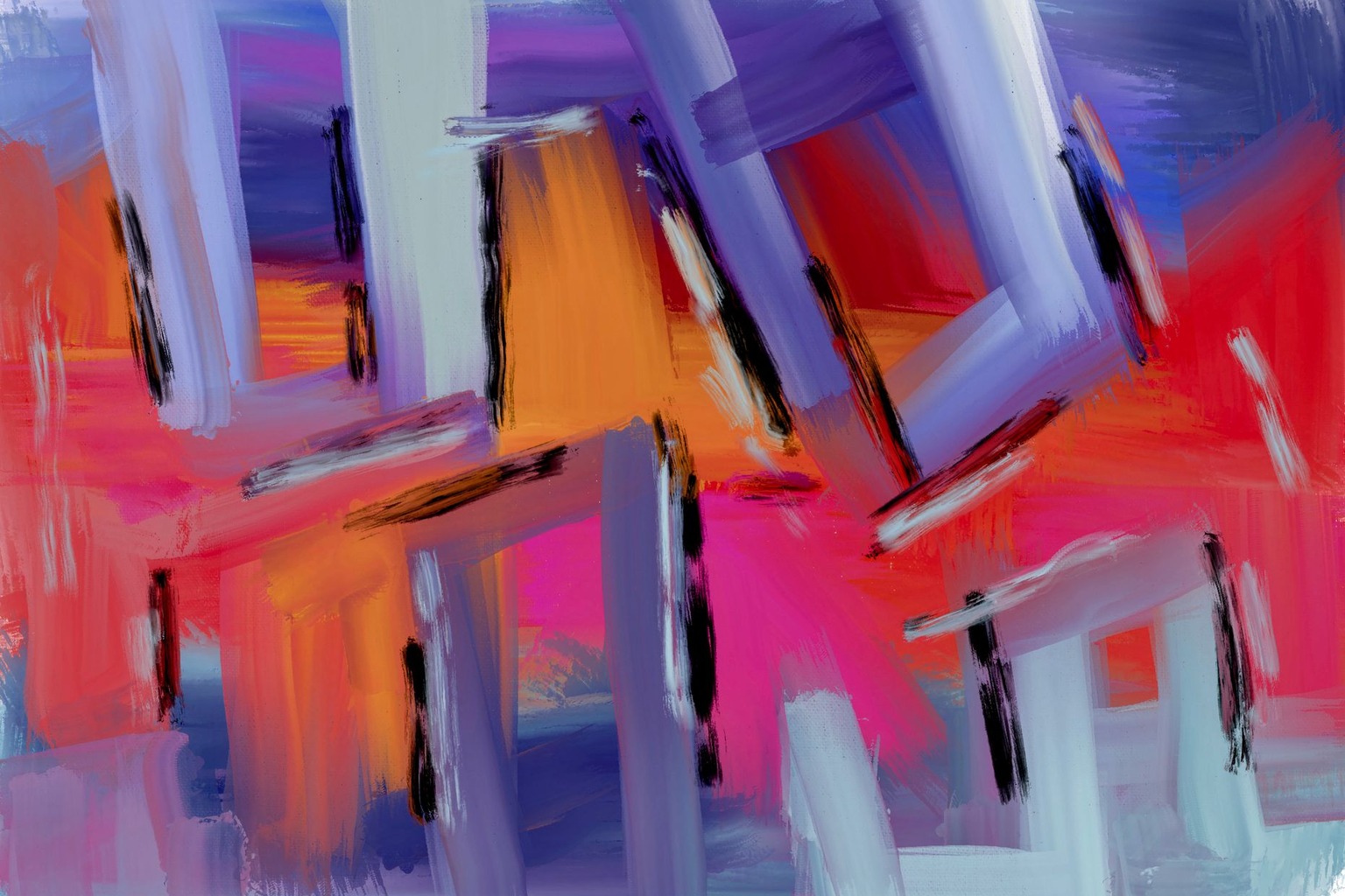
The cognitive effects of color extend to memory retention. Research in environmental psychology demonstrates that colors influence how well we recall information. A study published in Nature found that immersive environments with specific wall colors could alter physiological responses like heart rate and even productivity. Translating this to art, a gallery might notice that paintings with vibrant, high-contrast colors are more likely to be remembered by viewers, while those with muted or monochromatic palettes might evoke a quieter, more contemplative recall. This isn’t about making art more “marketable”, it’s about leveraging natural cognitive biases to create deeper connections. For collectors, this means that the emotional and intellectual impact of a piece isn’t just about its subject matter but also about the psychological framework of its color scheme.
Color and the Perception of Artistic Intent
The colors an artist chooses don’t just describe a scene, they communicate intent. A painter using predominantly dark, earthy tones might signal a mood of melancholy or grounded realism, as seen in the works of Edward Hopper. Conversely, an artist employing bright, saturated hues could be signaling joy, energy, or even artificiality, as in the pop art of Andy Warhol. These choices aren’t arbitrary; they’re part of the artist’s narrative. For viewers, color becomes a shorthand for understanding the emotional landscape of a work. When browsing an online gallery, a potential buyer might instinctively associate a painting’s palette with the artist’s emotional state or the story they’re trying to tell. This is why color harmony, or the deliberate balance of hues, is such a powerful tool in art. A well-composed palette can unify a piece, making its message clearer and more compelling.
This dynamic is particularly relevant in the digital art space, where color is often the first element a viewer notices. In an online gallery, where physical context is absent, color becomes the primary means of establishing tone and atmosphere. An artist selling digital prints might choose a palette that aligns with the intended emotional experience, cool blues for a sense of calm, warm yellows for warmth, or deep purples for mystery. The challenge for collectors is to recognize that these choices are intentional and to interpret them within the broader context of the artist’s body of work. A single painting might feel disjointed if its color palette doesn’t align with the viewer’s expectations of the artist’s style, while a cohesive collection can create a powerful, immersive experience.
Practical Applications for Artists and Collectors
For artists, understanding color psychology isn’t about manipulating emotions, it’s about deepening the dialogue between the work and its audience. One practical approach is to use color to guide the viewer’s journey through a piece. For example, a landscape painter might use warm tones in the foreground to draw attention to the subject and cooler tones in the background to create depth. This technique, rooted in color theory, aligns with psychological principles that emphasize contrast and focal points. Similarly, an abstract artist could use a limited palette to create a sense of unity, ensuring that the emotional impact isn’t diluted by visual clutter. The goal isn’t to control the viewer’s experience but to provide a framework that enhances their engagement with the art.
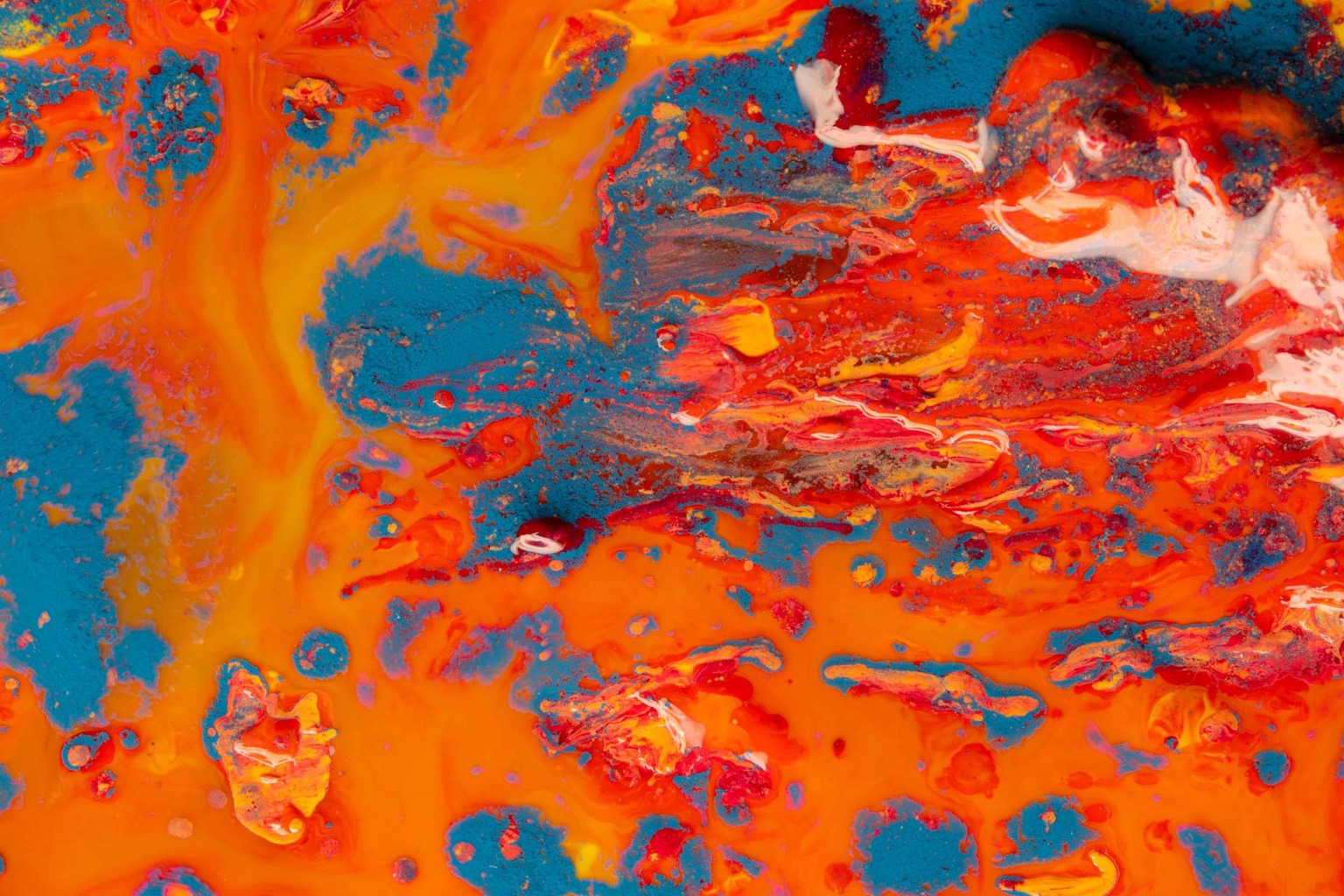
For collectors, color becomes a tool for curation. When building a personal collection or advising clients, understanding the psychological effects of color can help in selecting pieces that not only resonate aesthetically but also emotionally. For instance, someone seeking art to create a calming home environment might prioritize works with cool, muted palettes, while a space designed for energy and creativity could benefit from bold, warm hues. Online galleries can also use color to organize collections, grouping works by palette can create thematic cohesion and make browsing more intuitive. This approach isn’t about forcing a narrative onto the art but about recognizing how color naturally guides perception and emotion.
Nuances and Exceptions in Color Psychology
While color psychology provides valuable insights, it’s not a rigid science, individual differences, cultural context, and personal history all play a role. For example, someone with a history of anxiety might find blue tones soothing, while another individual could associate them with depression. Similarly, a color that feels uplifting to one person might feel overwhelming to another, depending on their mood or life circumstances. This variability means that while general principles apply, the impact of color is never absolute. Artists should avoid assuming that a particular palette will universally evoke a specific emotion; instead, they should consider their audience’s diversity and the broader context of the work.
Another nuance is the role of color in abstraction. In non-representational art, where there’s no literal reference to the natural world, color takes on even greater symbolic weight. A monochromatic painting might feel minimalist and contemplative, while a piece with high chromatic contrast could feel chaotic or dynamic. The absence of context in digital art further complicates this, as viewers rely entirely on the colors themselves to interpret meaning. This is why abstract artists often use color to create emotional resonance without relying on traditional symbolism. For collectors, this means that the interpretation of abstract works is deeply personal, and the psychological impact of color becomes even more subjective.

I have spent years transforming my home into a personal gallery, constantly hunting for unique pieces that bring walls to life. There is nothing quite like the thrill of discovering an emerging artist online and finding the perfect artwork to complement a room. I am passionate about helping others navigate the world of digital art markets to find authentic pieces that truly resonate with their style.