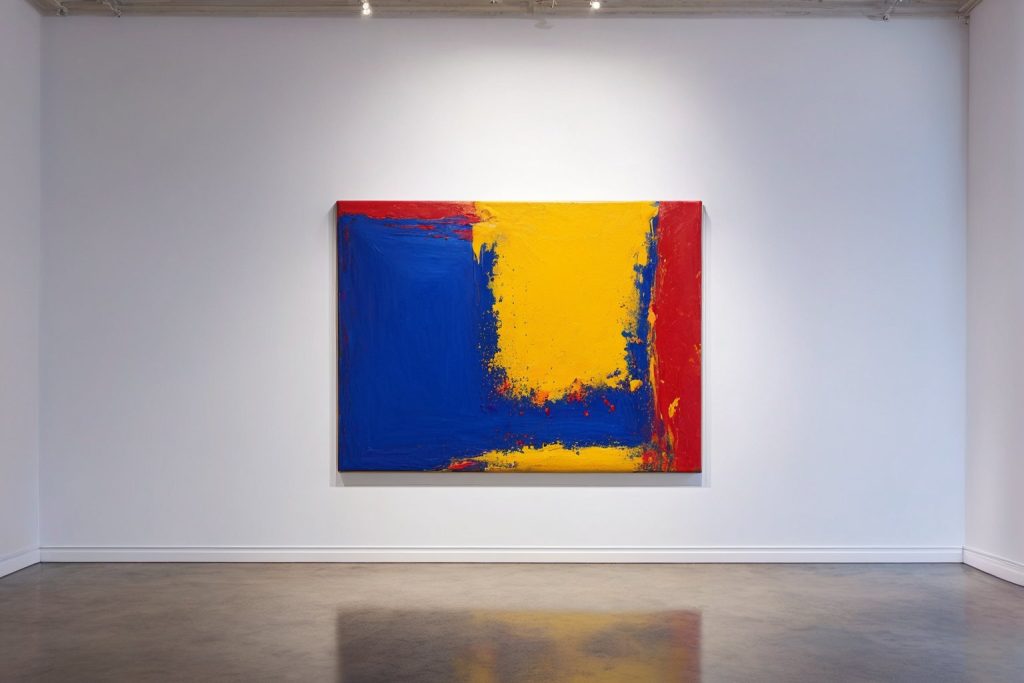
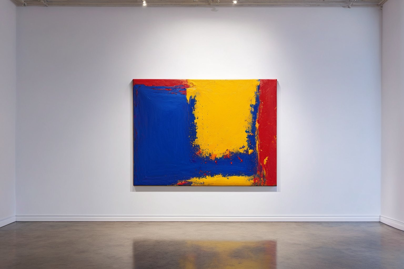
When you stand in front of a large-scale abstract canvas, your reaction is rarely logical. You feel warmth, tension, or calm before your mind even tries to decode the shapes on the surface. This immediate emotional response is driven by the psychology of color in abstract art, where pigments act as direct signals to the viewer’s nervous system rather than mere decorative elements. Artists working in this field understand that a specific shade of red can feel aggressive or inviting depending entirely on its context within the composition. For collectors and interior designers, grasping these dynamics helps explain why certain pieces transform a space while others leave it feeling flat or disconnected from the room’s purpose.
Warm versus Cool Temperature Shifts
The fundamental split in abstract painting often revolves around color temperature, which dictates the perceived energy of the piece. Warm hues like cadmium yellow and vermillion tend to advance toward the viewer, creating a sense of intimacy and immediate engagement that can make a room feel smaller but more personal. Cool tones such as cerulean blue and violet recede visually, adding depth and a sense of spaciousness that works well in tight urban apartments or minimalist offices. Artists manipulate this push-and-pull effect to control how long a viewer stays locked into the painting versus glancing at it briefly. Understanding this distinction helps buyers choose pieces that match the desired atmosphere of their specific living or working environment.
In practice, you will often see artists mixing these temperatures within a single canvas to create visual tension. A dominant warm background with cool accents can feel energetic yet grounded, while the reverse creates a dreamy but potentially unstable mood. This interplay is what separates a flat color field from a dynamic composition that invites repeated viewing. When selecting artwork for a gallery wall or a focal point, consider whether you want the piece to energize the space or provide a calming counterbalance to busy surroundings. The temperature balance is usually the first thing your eye registers, even if you cannot articulate exactly why the room feels different after hanging the piece.
Saturation Levels and Emotional Intensity
Saturation, or the purity of a color, plays a decisive role in how intense an abstract painting feels to the observer. Highly saturated colors demand attention and can overwhelm a space if used carelessly, particularly in small rooms where visual noise accumulates quickly. Muted or desaturated tones offer a softer entry point, allowing the viewer to absorb the composition without feeling bombarded by vivid stimuli. Many contemporary artists deliberately limit their palette to two or three low-saturation shades to create a sense of quiet contemplation rather than dramatic impact. This approach is especially effective in bedrooms or meditation spaces where visual calmness is the primary goal.
Conversely, high saturation works powerfully in high-traffic areas like living rooms or entryways where you want the artwork to command presence. A single bold stroke of intense magenta against a neutral gray background can anchor an entire room and spark conversation among guests. The key is balancing these intense moments with sufficient negative space so the eye has places to rest. Buyers often underestimate how quickly saturated colors fatigue the eye, leading them to seek out subtler options for daily viewing. Choosing the right saturation level depends heavily on how long you expect to look at the piece each day.
Cultural Associations and Personal Memory
color perception is never purely objective because it is filtered through individual cultural backgrounds and personal memories. A shade of green might evoke nature and growth in one viewer’s mind, while another associates it with sickness or envy based on past experiences. This subjectivity means that the same abstract painting can elicit completely different reactions from people standing side by side. Artists aware of this variance often use ambiguous color combinations that allow multiple interpretations without forcing a single narrative. This openness invites viewers to project their own stories onto the canvas, making the piece more personally meaningful over time.
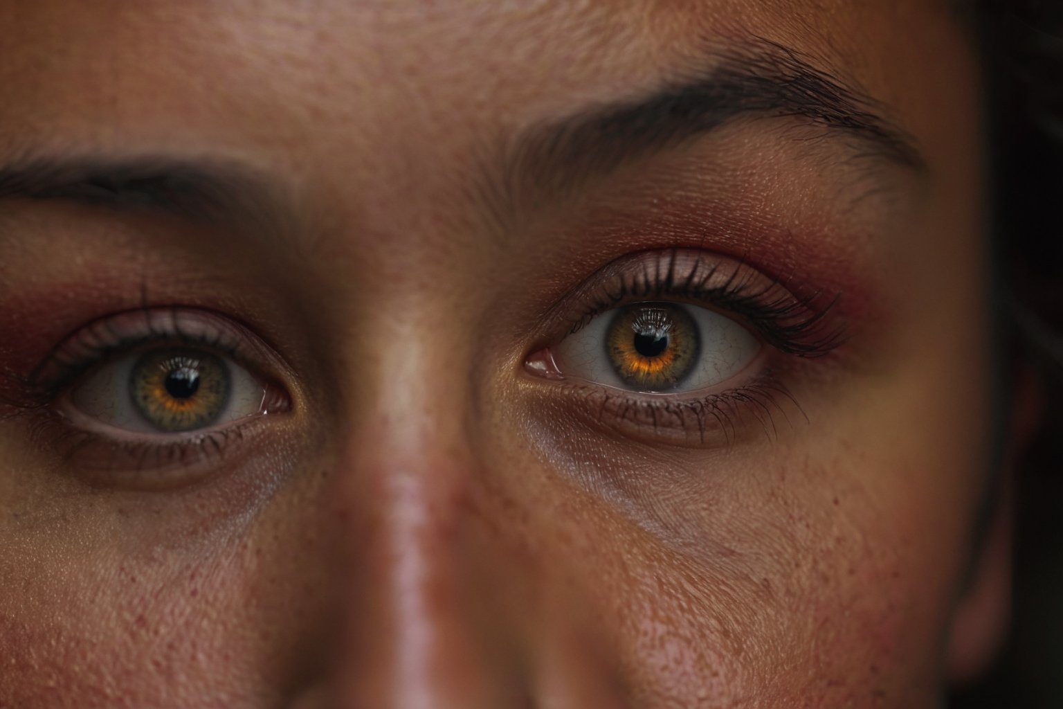
For collectors, this means there is no universal “right” choice based solely on color theory rules. A piece that feels harmonious in a studio might feel discordant in a home because of the different contextual cues present in each environment. It is helpful to test a smaller work or a digital mockup in the actual space before committing to a large investment. Your personal emotional response to the colors is the most reliable indicator of whether the piece will serve you well for years. Trusting your gut reaction over generic advice often leads to more satisfying long-term ownership experiences.
Contrast Dynamics and Visual Flow
Contrast between adjacent color areas determines how the eye moves across the surface of an abstract painting. High contrast pairs, such as black against bright white or deep blue against orange, create sharp visual boundaries that guide the viewer’s gaze in specific directions. Low contrast combinations blend more softly, encouraging a slower, more meandering exploration of the piece without a clear starting or ending point. Artists use these dynamics to choreograph the viewing experience, much like a composer uses rhythm and tempo in music. Understanding how contrast directs attention helps you predict whether a piece will feel structured or chaotic when hung on your wall.
In modern abstract works, you might see artists deliberately disrupting expected contrast patterns to create surprise or disorientation. A gradual shift from warm to cool tones without a hard break can feel like a gentle wave, while abrupt juxtapositions feel like a sudden jolt. This technique allows the artist to control the emotional pacing of the piece as it is viewed from different distances. When evaluating potential acquisitions, step back from the painting and observe where your eye naturally travels first and where it gets stuck. If the flow feels frustrating or confusing in a way you do not enjoy, the contrast structure may not suit your personal taste.
Lighting Conditions and Color Perception
The physical lighting in a room dramatically alters how colors appear in abstract paintings, often shifting the perceived mood entirely. Natural daylight provides full spectrum illumination that reveals the true character of pigments, while warm artificial light can make cool tones look muddy or dull. Cool white LED lighting, on the other hand, can exaggerate the brightness of certain hues and wash out subtle undertones in others. This variability means that a painting approved under one lighting scheme might feel wrong under another, leading to buyer’s remorse if not tested properly. Professional art advisors often recommend viewing pieces under multiple light sources before making a final purchase decision.
For online shoppers buying from galleries, this challenge is even more acute because screen colors do not perfectly match physical pigments. Digital displays use additive color mixing (RGB) while paintings use subtractive mixing (pigments), resulting in inherent differences in vibrancy and depth. To mitigate this risk, look for detailed photographs taken in natural light or request video clips that show the painting under different conditions. Understanding these technical limitations helps set realistic expectations for how the physical piece will look in your home. It is a practical consideration that separates informed collectors from those who rely solely on digital previews.
Scale and Proportion Effects
The physical size of an abstract painting relative to its surrounding space changes how its colors are perceived and felt. A small canvas with bold, saturated colors might feel playful and contained, while the same colors on a monumental scale can become overwhelming or oppressive. Large formats amplify the emotional impact of color fields, making them feel immersive rather than decorative. This scaling effect is why artists often adjust their palettes when working on different sized canvases, using deeper tones for large pieces to maintain visual weight. Buyers need to consider the wall space available and how the size of the piece will interact with existing furniture and architectural features.
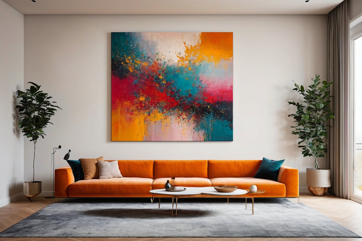
In modern interior design, oversized abstract works are increasingly used as structural elements that define a room’s aesthetic identity. The color choices in these large pieces must account for the distance from which they will be viewed, as fine details disappear at scale but broad color masses remain dominant. This makes the overall tonal harmony more important than intricate brushwork or small accent colors. When browsing a gallery collection online, pay attention to the dimensions listed alongside the price and visualize how that size would occupy your specific wall. A piece that looks perfect in a thumbnail may feel dwarfed or dominating in reality if the scale is not carefully considered.
Longevity of Color Trends
Trends in color preferences shift over time, influencing what feels contemporary versus dated in abstract art collections. Certain hues, such as muted earth tones and soft pastels, tend to remain timeless because they align with natural environments and neutral interior palettes. Bright neon shades or highly trendy colors may feel exciting now but risk looking outdated within a few years as design tastes evolve. Artists who work with enduring palettes often create pieces that maintain their relevance and appeal for decades, making them stronger long-term investments. This durability is a key factor for collectors who view their art holdings as both aesthetic pleasures and financial assets.
When building a collection, it is wise to balance trend-driven pieces with timeless color choices to keep the overall aesthetic fresh without constant replacement. A mix of bold, current-color statements alongside neutral, enduring works creates a dynamic yet stable visual environment. This approach allows you to enjoy the energy of contemporary trends while anchoring your space with pieces that will not feel stale. Consulting with an art advisor can help identify which color combinations have historical staying power and which are likely to fade in appeal. Your collection should reflect both current interest and long-term satisfaction, ensuring that every piece continues to resonate for years to come.

I have spent years transforming my home into a personal gallery, constantly hunting for unique pieces that bring walls to life. There is nothing quite like the thrill of discovering an emerging artist online and finding the perfect artwork to complement a room. I am passionate about helping others navigate the world of digital art markets to find authentic pieces that truly resonate with their style.