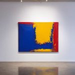

Visual art on an e-commerce platform lives or dies by how it holds attention. Rhythm and movement are the invisible engines that pull a browser’s eye across a canvas, guiding them from one detail to the next without a conscious thought. In the world of online art sales, these elements are not decorative flourishes; they are strategic tools that convert a passing glance into a considered click. A painting with static composition may be technically proficient, but it rarely compels action. Conversely, a work that pulses with implied motion can stop the scroll, inviting the viewer to linger, examine texture, and ultimately consider purchase. Understanding how rhythm functions as a visual tempo, and how movement suggests narrative direction, is essential for any curator or artist seeking to optimize their online presence. The digital gallery is a competitive space where split-second decisions dictate success, and rhythm is the first point of engagement.
Repetition and Interval as Visual Tempo
Repetition creates a beat that the eye can follow, establishing a predictable pattern that can either soothe or energize depending on the interval. In representational art sold online, repeated motifs, such as a row of windows in a cityscape or recurring petals in a floral study, establish a rhythm that the brain recognizes instantly. The spacing between these repetitions, the interval, dictates the tempo. Tight spacing creates a fast, buzzing energy, suggesting urgency or excitement, while generous spacing slows the eye down, inviting contemplation. For an internet gallery, manipulating this interval allows the curator to control the viewer’s pace. A piece with dense, close repetition might feel frantic and modern, suitable for impulse buys, whereas a work with wide, open intervals suggests luxury and depth, encouraging the buyer to spend time with the description and details before committing.
The direction of that rhythm, whether it flows horizontally, vertically, or diagonally, also impacts how a piece is perceived on a screen. Horizontal rhythms often feel calm and restful, mirroring the horizon or a calm sea, which can be effective for landscape works where a peaceful mood is the selling point. Diagonal lines, however, inject dynamism; they imply movement forward or upward, which can make a static image feel like it is in flux. In a retail context, diagonal rhythms can guide the eye toward a “Buy” button or product information placed at the bottom of the frame. The expert artist uses these directional cues not just for aesthetics, but as signposts that lead the customer’s journey through the visual information, subtly influencing the likelihood of a sale.
Line Quality and the Suggestion of Motion
Line quality is the brushstroke equivalent of tempo rubato in music; it can accelerate or decelerate the perceived movement within a composition. Sharp, angular lines create a staccato effect, suggesting sudden stops, starts, or aggression. These are powerful in abstract works or modern pieces where energy and conflict are the desired emotional sell. Soft, flowing lines, by contrast, create a legato feel, suggesting grace, fluidity, and continuous motion. When a viewer encounters a painting with sinuous, curving lines, the eye tends to follow those curves smoothly, creating a sense of effortless movement. For an online store, the choice between sharp and soft lines should align with the intended emotional response of the target demographic. A piece with vigorous, broken lines might appeal to a younger, edgier audience, while fluid, organic lines might attract those seeking calm and sophistication.
Furthermore, the thickness and variability of a line can signal depth and priority, effectively creating a visual rhythm of importance. A artist might use a thick, bold outline to frame a central subject, then taper the lines outward into thinner, more delicate strokes. This gradient of line weight creates a rhythmic path for the eye to travel, starting at the focal point and radiating outward. It prevents the viewer’s gaze from stagnating in one area and encourages them to explore the entire composition. In the context of an internet marketplace, this technique is valuable because it ensures that the viewer sees the whole artwork, not just the center, increasing the chance they will notice secondary details like signature placement or subtle background elements that add to the artwork’s value.
Color Gradation and Optical Movement
Color possesses an inherent weight and temperature that can simulate movement without any actual lines or shapes shifting. Warm colors, reds, oranges, yellows, advance visually, appearing to come forward, while cool colors, blues, greens, purples, recede, appearing to recede into the distance. This principle of color temperature creates an optical rhythm that the brain interprets as motion. An artist can use a gradient of shifting temperatures across a canvas to create a sense of depth and vibration. For instance, a landscape might transition from a deep, receding blue at the horizon to a bright, advancing orange in the foreground. This temperature shift tricks the eye into perceiving a three-dimensional space on a two-dimensional screen, effectively adding a layer of “movement” that enhances the realism and appeal of the piece.

Saturation also plays a role in this visual tempo. Highly saturated, vivid colors demand attention and can act as visual “accents” or beats in a composition. Desaturated, muted areas act as the “rests” in a musical phrase, providing breathing room. A painting that balances saturated focal points against a muted background creates a rhythmic contrast that keeps the eye moving. In an e-commerce setting, this is particularly useful for highlighting specific features of the artwork, such as a signature or a unique texture detail. By placing a pop of high saturation in a strategic location, the seller can guide the customer’s eye to the most important information, ensuring that the artistic intent is communicated clearly even at small thumbnail sizes.
Compositional Balance and Perceived Stability
The way elements are arranged within a frame determines whether a piece feels static and stable or dynamic and precarious. Symmetrical compositions often feel static; they suggest a frozen moment in time, a calm that is pleasing but rarely prompts the eye to travel far. Asymmetrical balance, however, introduces tension. When heavy elements are placed on one side and lighter elements on the other, the viewer’s eye must work to find equilibrium, creating a sense of movement as it searches for balance. This “visual weight” dynamic is a powerful tool for online art sellers. A painting that feels unstable or in motion can feel more “alive” and engaging than a perfectly balanced one, encouraging the viewer to spend more time analyzing the composition to understand why it feels the way it does.
The rule of thirds is a classic example of using asymmetry to create movement. By placing the main subject off-center, the artist leaves “empty space” that the eye fills by moving toward the edge of the frame. This movement creates a narrative suggestion, that there is something happening just outside the picture plane. For an internet gallery, this technique can be used to create a sense of story or context. A portrait with the subject looking toward the edge of the canvas implies a direction of travel or a thought process, which can be more engaging for a potential buyer than a direct stare. It transforms the artwork from a simple image into a scene with a beginning and an end, increasing the emotional investment of the viewer.
Texture and Surface Rhythm
Physical texture, even when represented digitally, adds a tactile rhythm that can simulate the experience of viewing art in person. Impasto techniques, where paint is laid on thickly, create actual physical peaks and valleys. In a digital image, these are represented through highlights and shadows that mimic the way light hits a raised surface. This surface rhythm creates a shimmering effect as the eye moves across the work. A painting with heavy texture will catch the light differently depending on the angle of the viewer’s screen or device, creating a dynamic interaction that a smooth, flat image cannot replicate. For an online retailer, emphasizing texture in product photography, through careful lighting that reveals brushstrokes, can make a work feel more valuable and “real,” justifying a higher price point.

Beyond impasto, the repetition of brushstroke direction creates an invisible rhythm. If an artist consistently applies strokes in a clockwise direction, or if they vary the direction to create a woven pattern, the eye picks up on this cadence. This “stroke rhythm” can unify a chaotic composition, tying disparate elements together through a shared movement pattern. In the context of selling art online, highlighting this texture and stroke direction in close-up zoom features allows the customer to feel the artist’s hand. It transforms the transaction from looking at a picture to experiencing the materiality of the work, which is a critical differentiator in a market flooded with digital reproductions.
Negative Space as a Silent Beat
Negative space, the area around and between the subjects of an image, is often overlooked but is a critical component of visual rhythm. It acts as the “rest” in a musical composition, the silence between notes that gives the melody its meaning. Effective use of negative space creates a rhythm by defining the boundaries of the positive shapes. A subject isolated by a vast expanse of empty canvas forces the eye to jump from the subject to the edge and back again, creating a pulsating effect. This technique is particularly effective for minimalist works or portraits where the simplicity of the composition relies on the tension between what is there and what is not. In an online gallery, the clever use of negative space can make a small image feel larger and more significant, preventing the art from feeling cramped or cluttered in a thumbnail view.
Moreover, negative space can be used to direct attention and create implied movement. If a figure in a painting is looking toward a large area of empty space, the viewer’s eye follows that gaze into the void, creating a sense of anticipation or longing. This “directional negative space” guides the viewer’s focus without the need for explicit arrows or lines. For a seller, this is a subtle way to emphasize the mood of the piece. A landscape with a tiny figure walking toward a vast, empty sky suggests a journey or a quest, themes that are often more sellable than a static scene. It invites the buyer to project their own narrative onto the work, which increases emotional connection and the likelihood of purchase.

I have spent years transforming my home into a personal gallery, constantly hunting for unique pieces that bring walls to life. There is nothing quite like the thrill of discovering an emerging artist online and finding the perfect artwork to complement a room. I am passionate about helping others navigate the world of digital art markets to find authentic pieces that truly resonate with their style.